

Alarm List
Dieser Inhalt ist noch nicht in deiner Sprache verfügbar.
Alarm List component
Section titled “Alarm List component”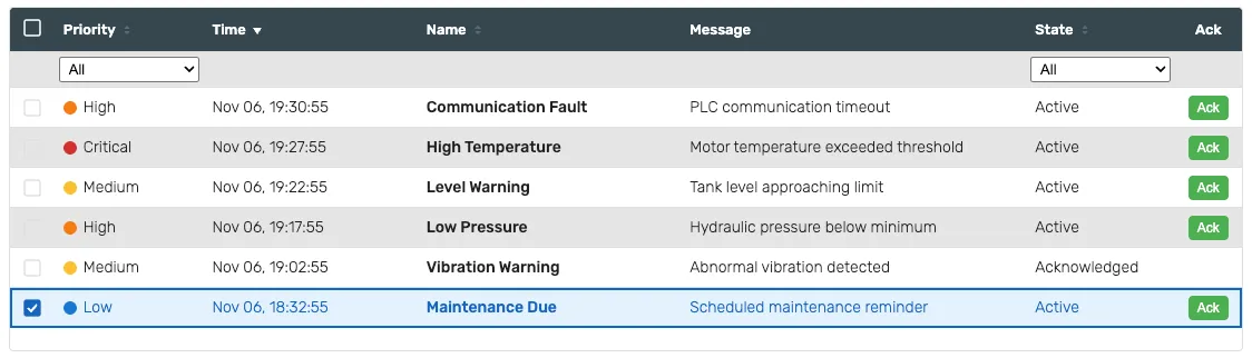
The alarm list is the full view of what is currently in alarm: one row per alarm, with the columns you choose. Rows are coloured by priority, and the table can be sorted by clicking a column header.
Features
Section titled “Features”Configuration
Section titled “Configuration”Show filters - shows a filter row beneath the header, so the operator can narrow the list at runtime.
Acknowledge column - shows an Ack button on each row.
Shelve - shows a shelve control. Shelving silences an alarm temporarily without closing it.
Shelve duration - how long a shelved alarm stays shelved, in minutes. The default is 60.
Multi-select - lets the operator select several rows at once, using the checkbox column.
Keyboard navigation - lets the operator move through the rows with the keyboard.
Columns
Section titled “Columns”Each column can be shown or hidden independently:
Priority, Time, Name, Message, Category, Area, Equipment, Value, State and the Ack column.
Hiding a column only changes what the operator sees; it does not change what the runtime records.
Alarm filter
Section titled “Alarm filter”Every alarm component shares these three properties. They decide which alarms this component shows; they never change the alarms themselves. An empty value means “show all”.
Areas - show only alarms from these areas. Add one entry per area.
Category - show only alarms of this category. The options come from the connector’s own category table, so they cannot drift from the values the filter compares against.
Min priority - show only alarms at or above this priority.
Alarms are raised by the runtime, not by the HMI — see Alarming.
The style properties define the look of the component.
Row height - the height of each row in pixels.
Header height - the height of the header row in pixels.
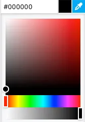
Each priority - Critical, High, Medium and Low - has its own background and text color. A hex value can be input in one of the formats:
#RRGGBB#RRGGBBAA#RGB#RGBA
Where:
R=red color componentG=green color componentB=blue color componentA=alpha (transparency) component
Alternatively, the integrated color picker can be used to visually pick a color:
Opacity - controls the transparency of the component.
Position
Section titled “Position”Left - distance from the left edge in pixels
Top - distance from the top edge in pixels
Width - component width in pixels
Height - component height in pixels. The table scrolls when the rows do not fit.
Typography
Section titled “Typography”Font size - the size of the text inside the component.